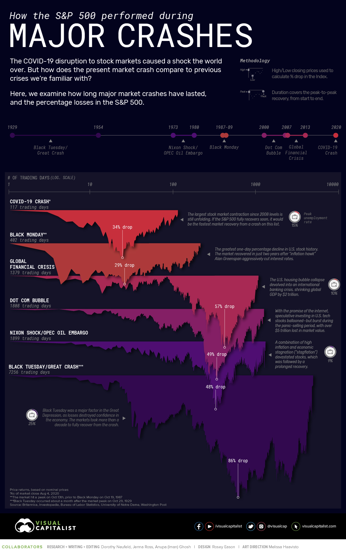
Visual Capitalist posted a plot that covers S&P 500 performance during major crashes. In this post, we will attempt to replicate some or most parts of the plot.
Source: https://www.visualcapitalist.com/sp-500-market-crashes/
The chart looks great 👏🏽 and probably challenging to accomplish with the tools I work with.
However, We do not need to replicate the entire plot. We can start simple. Let’s start with the main component - the row-wise plots that visualise S&P 500 performance during major recessions.
And, see how much else we can add.
Data
Visual Capitalist used the data from Macrotrends, which is a paid dataset. We can replicate the data using following:
- SP500 Data: Export ^GSPC (SP 500) data from Yahoo Finance
- Recession Data: Copy the Major Market crash table from Visual Capitalist in excel and save as csv
Next, We need to do is load the data in Pandas and do the transformation (merge/apply/filter):
- filter ^GSPC data that does not belong to any recession
- attach title from recession data
- calculate
days into the crashandpercent drop
Note: they use Aug 4, 2020 as the end date (or cut-off date) for COVID crash
Plot
Once we have the dataframe in place, the following code will generate the plot.
Note that we are not using log scale, I personally prefer to use it only if it is absolutely necessary.
For example, in the original chart you can no longer visually compare the number of days in crash.
The Great Crash was the longest as well as the worst.
# altair
alt.Chart(df_crashes.reset_index()).mark_area().encode(
    alt.X('days_into_crash:O', title="Days Into the Crash", axis=alt.Axis(labelAngle=45)),
    alt.Y('pct_drop:Q', title=""),
    alt.Color('title', legend=None),
    alt.Row('title', title="", header=alt.Header(labelAngle=0, labelAlign='left')),
    alt.Tooltip(['title', 'pct_drop'])
).properties(
    title="How the S&P 500 Performed During Major Market Crashes",
    width=1000,
    height=120
).configure_view(
    stroke=None
).configure_title(
    anchor='middle'
).configure_axis(
    grid=False
)

TODOs
Add Plot for each major crash
Add pandas code
Add annotations
Add year sub plot
S&P 500 started 2020 with $3,257.87 and its about to close at around $3,727 during the final trading days of the year.