This is a remake of chartr.co chart on hangover cure google trend.
When I started working on this mini dataviz project, tidy tuesdays of sort, I was hoping to complete it in a few hours. But as I created the first notebook with Matplotlib, I got greedy and decided to remake the chart using different libraries and languages. The result is this post and a set of notebooks.

Data
The data comes from Google Trends.
Data Source: Google Trends
Search Term: Hangover Cure
Region: United States (default option)
Date Range: Past 90 days
Plots
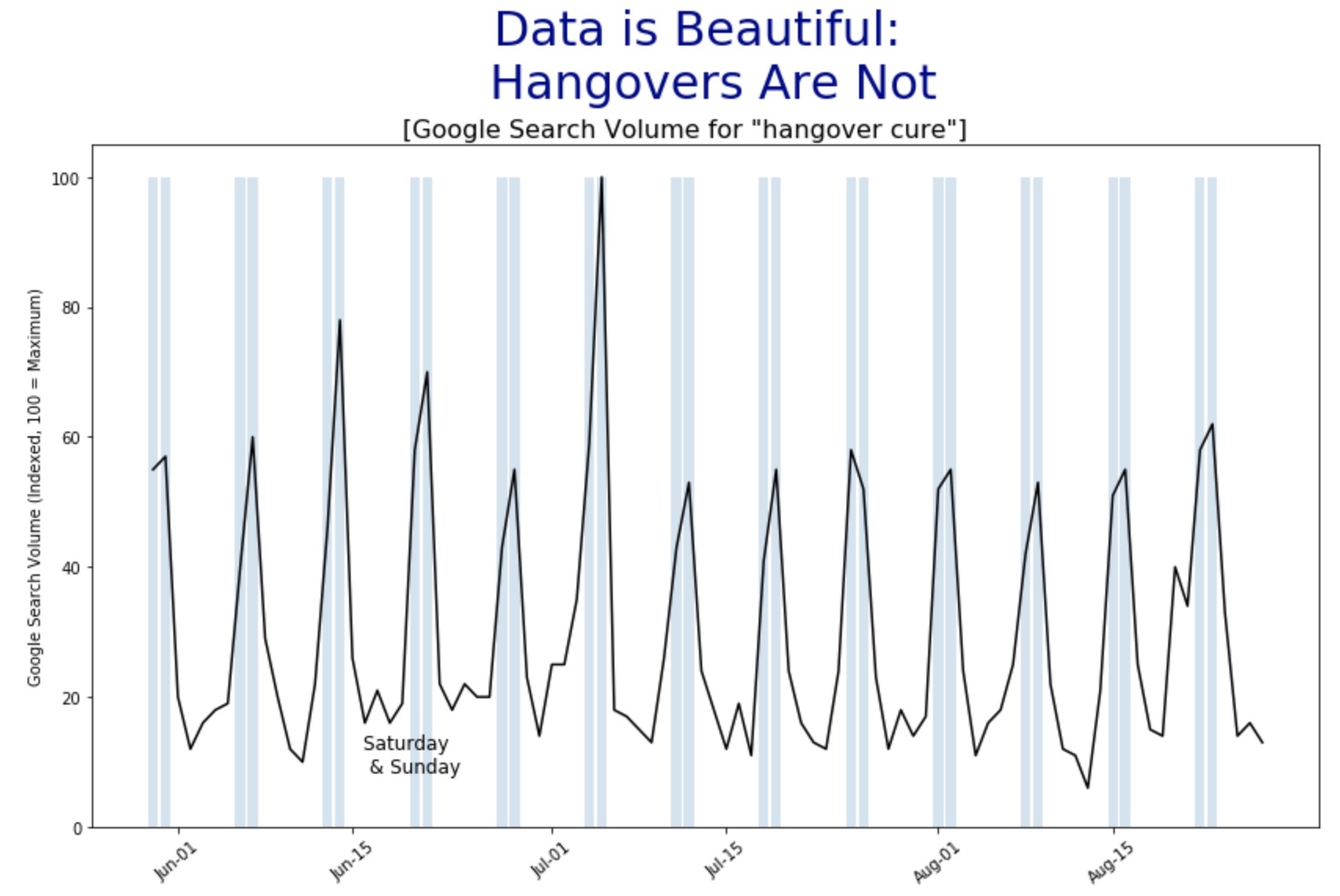
Python: Matplotlib
The following snippet covers the most of what is need to generate the plot. We pass the dataframe and the function returns the plot.
def generate_plot(df):
    fig, ax = plt.subplots(figsize=(14,8))
    formatter = mdates.DateFormatter("%b-%d")
    ax.xaxis.set_major_formatter(formatter)
    # set x-axis rotation
    for label in ax.get_xticklabels():
        label.set_rotation(40)

    ax.plot(df.Day, df.Count, color='black')
    ax.bar(df[weekends].Day, [100]*len(df[weekends].Day), alpha=0.2)
    ax.set_title("Data is Beautiful: \n Hangovers Are Not", fontsize=30, color="darkblue", pad=30)
    ax.set_ylabel("Google Search Volume (Indexed, 100 = Maximum)")

    return ax

ax = generate_plot(df)
plt.show()
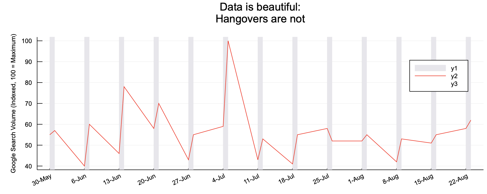
Python: Altair
In case of Altair, the following snippet will generate the line chart, bar and the annotation. The added benefit of using Altair is that, its extremely easy to create interactive charts. You can also export the chart it the vega format and display it on the web. For example, my crowd density model evaluation post uses this approach. All the plots on that post were generated using Altair.
# Creates the line chart
base = alt.Chart(df).mark_line(color="black").encode(
    alt.X('Day:T', axis=alt.Axis(title="", format=("%b %d"), labelAngle=-45, grid=False)),
    alt.Y('Count:Q', title="Google Search Volume (Indexed, 100 = Maximum)", axis=alt.Axis(grid=False))
).properties(
    title="Data is Beautiful. Hangovers Are Not",
    width=1000,
    height=500
)

# Create bars
bar = alt.Chart(x_tick_values).mark_bar(size=12, opacity=0.2).encode(
    alt.X('Day:T'),
    alt.Y('Count:Q')
)

# Adds annotation
text = (
    alt.Chart(df.query("Day == '2020-06-21'"))
    .mark_text(dy=280, color="#4F61A1")
    .encode(x=alt.X("Day:T"), y=alt.Y("Count:Q"), text=alt.Text("label"))
)

base + bar + text
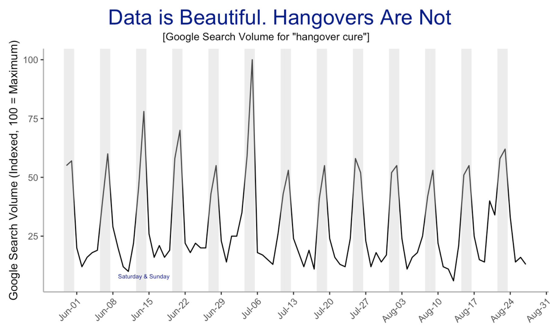
Julia: Plots
Notice that with very few lines of code, we can create the chart.
# Add the bars
vspan(df.Day, color="#e7e6eb")
plot!(df[:, 1], weekends_df[:, 2], color="red", xticks=(xticks, xlabels), xrotation=25, legend=false, size=(1000,400))
# This fixes the issue of vspan overriding the ylabels
vline!(df.Day, color="#e7e6eb",alpha=0.0, legend=true)
plot!(title="Data is beautiful: \n Hangovers are not", margin=10mm, ylabel="Google Search Volume (Indexed, 100 = Maximum)", yguidefontsize=8)
Julia: Unicode Plot
This library allows us to create the plots in the shell. And while we are not able to replicate the chart here, the output still looks so cool.
function plot(df, plt)
    xticks = collect(df.Day[1]:Dates.Day(7):df.Day[lastindex(df.Day)])
    if @isdefined plt
        plt = lineplot!(plt, df[:, 1], df[:, 2], color=:green)
    else
        plt = lineplot(df[:, 1], df[:, 2], width=80, title="Data is beautiful. Hangovers are not", ylabel="Google Search Volume (Indexed, 100=Maximum)")
    end
    # lineplot!(plt, xticks=xticks)
    return plt
end

function plot_vspan(plt, df)
    weekend_df = weekends(df)
    xs = vspan_xs(weekend_df)
    ys = vspan_ys(nrow(weekend_df))
    for i in 1:2:nrow(xs)-1
        lineplot!(plt, xs[i:i+1, 1], ys[i:i+1], color=:yellow)
        # println(xs[i:i+1, 1], ys[i:i+1])
    end

    annotate!(plt, :r, 1, "|| Sat & Sun", color=:yellow)
    annotate!(plt, :r, 3, "-- Search Volume", color=:green)

    return plt
end
R: GGPlot2
And to create stunning plots in R, there is ggplot2. It is such a joy to work with, along with all the other tidyverse packages. And this does not mean I did not enjoy working with other packages used above. They’re all fun to work with too.
plt <- ggplot(df, aes(Day, Count)) +
  geom_line() +
  scale_x_date(date_breaks = "weeks", date_labels = "%b-%d") +
  labs(title = "Data is beautiful. Hangovers are not", x="", y="Google Search Volume (Indexed, 100 = Maximum)") +
  theme(axis.text.x = element_text(angle=45, hjust=1), panel.grid.major = element_blank(), panel.grid.minor = element_blank(),
        panel.background = element_blank(), axis.line = element_line(colour = "darkgray")
        )

plt <- plt + geom_vline(aes(xintercept=Day),
                 data=df %>% filter(weekday %in% c("Saturday", "Sunday")), color="gray",
                 alpha=0.3, size=2.3)
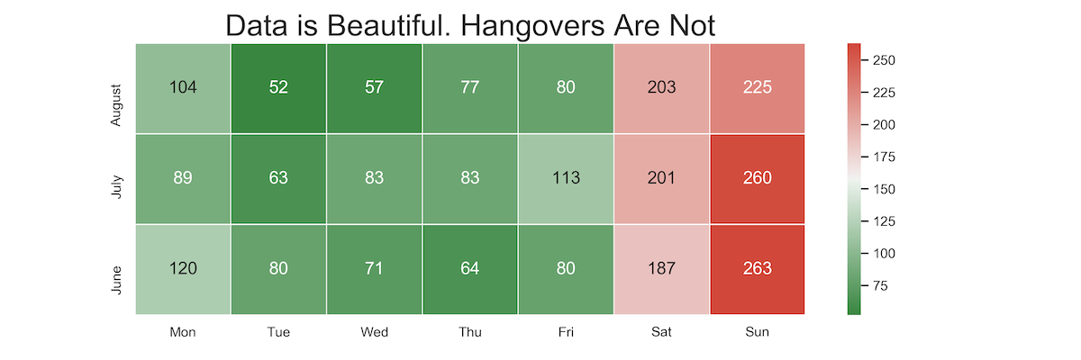
Heatmap
Personally, I would prefer to show the data as heatmap.